Improving user engagement and conversions on a high-traffic retail site
Young's Hirewear — Outfit Summary A/B Test
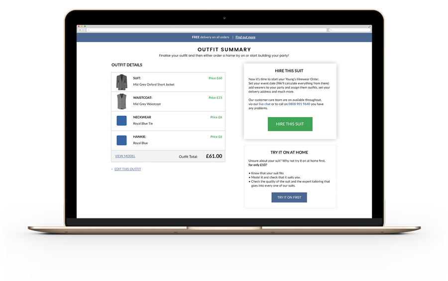
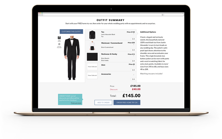
Young's Hirewear, a UK-wide hirewear provider, was seeing a big drop-off on its Outfit Summary page, with few people completing orders or booking try-ons. The challenge was to simplify the page and make it easier for customers to take action.
My role: Collaborating with stakeholders to redesign and test
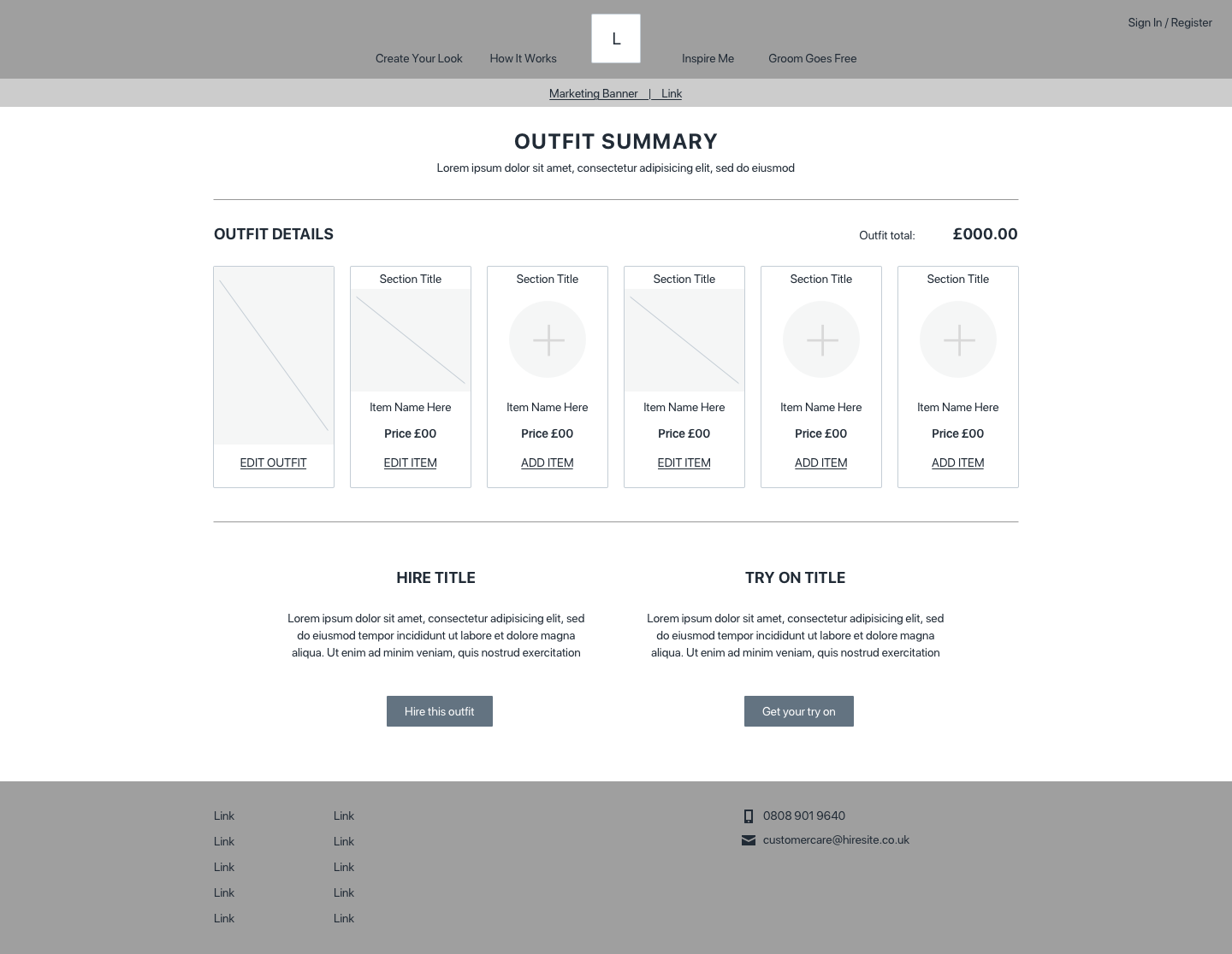
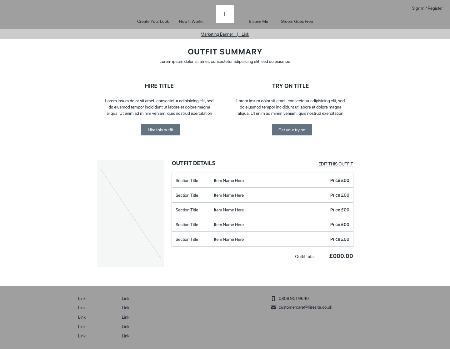
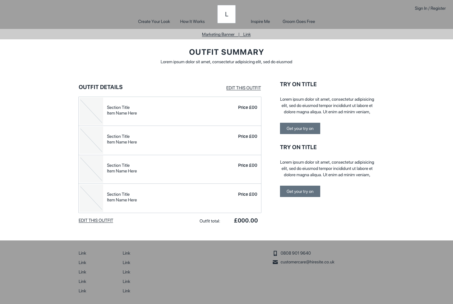
Working closely with key team members, I sketched multiple wireframe concepts aimed at reducing user confusion and streamlining choices. We reviewed these collectively and combined the strongest features into a final wireframe design.
- UX Analysis
- Wireframing
- A/B Testing
- CTA Optimisation
- UI Design
- Conversion Strategy
What the test showed
The new page reduced options to avoid overwhelming users, emphasised the 'Try On' secondary call-to-action with benefit-focused copy, and replaced the primary button text from "Add to Order" to "Hire Suit" for clarity and appeal.
The A/B test ran for 10 days, and the new page increased the number of visitors reaching the order process by 53%. Other tests were running at the same time, so I can't credit this page alone for the drop in bounce rate.