Designing a poker analysis tool that makes HUDs simple, not stressful
Pokercube — Windows Desktop Application
Most poker tracking tools rely on complex HUDs (heads-up displays) that demand heavy customisation and in-depth setup — particularly frustrating for casual or mid-level players. Stack sizes change frequently during a tournament, and many tools struggle to reflect that dynamically or clearly.
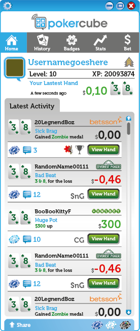
Pokercube was developed as a Windows desktop application that could be used straight out of the box — helping players track hand history, analyse their performance, and share key hands with minimal setup.
- UI/UX Design for Windows
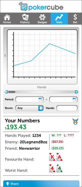
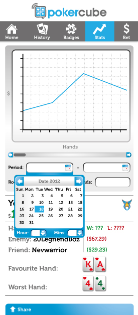
- Data Simplification & Visualisation
- Accessibility Considerations
- Brand & Marketing Design
- User Flows
My role: Designer across product, brand, and marketing
I led the design of the Pokercube interface, with a focus on making data-rich workflows easy to access and understand. Because the app was built specifically for Windows, I had to account for platform-specific constraints — including fixed window dimensions that had implications for layout, scaling, and accessibility. These limitations shaped how I approached typography, spacing and controls, ensuring the app remained legible and usable at all times.
From a UX perspective, I focused on:
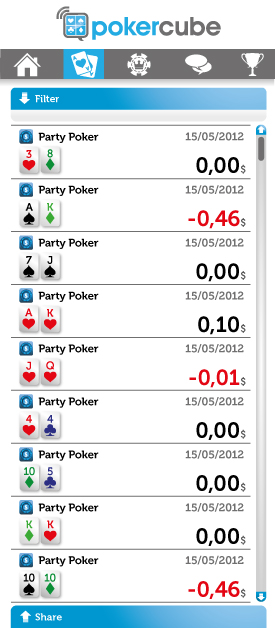
- Simple, uncluttered hand and session views
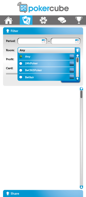
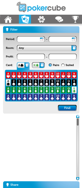
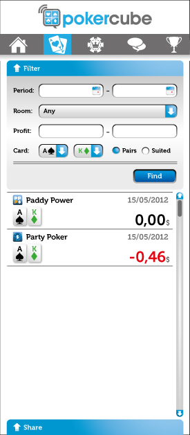
- Streamlined navigation and filtering
- Built-in share functionality for players reviewing hands with coaches or peers
Since this was a brand-new product, I also helped define its visual identity — working on early brand development, interface styling, promotional materials and supporting marketing campaigns. This ensured consistency across the product and its public presence.


Outcome
Pokercube launched with a clear value proposition: to offer the essential tools poker players needed, without the typical setup burden. Feedback from users highlighted how intuitive the experience was compared to other HUDs, especially for those who wanted fast insights and clean session reviews.